If you look atop our website, you’ll see a unique diamond-shaped icon to the left of our organization’s name, and that new brand mark is, well, brand new to us. The name “brand mark,” by the way, is just another fancy way to say “logo,” and we’re really happy to tell you how we came up with the design.
And we say “we,” but what we mean is this: Most of the actual thinking, creativity, tweaking and artistry involved in the evolution of our new brand mark was accomplished by Juli Johnson from 360 Creative Vision, the company behind our new logo.
Most brand marks have an enormous amount of thought behind them and ours is certainly no exception.
Ask Juli and she’ll tell that our co-founders, Zac and Celine Adair, pretty much gave her free rein on the design, telling her they’d really like something that is simple and iconic. But in the same breath, Juli will also tell you that while talking with these two nature lovers, she sensed that both possess a Zen-like, spiritual attitude when it comes to anything that exists in nature.
For instance, Zac told Juli he certainly didn’t expect her to present an obligatory drawing of a pine tree on a hill. Not only would that be a reminder of a car freshener, but it seemed redundant to him in comparison to what the other businesses and organizations similar to The National Center for Outdoor & Adventure Education (NCOAE) were using.
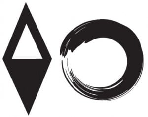
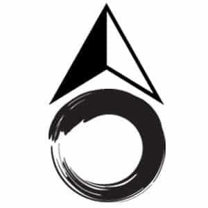
The seeds for Juli’s inspiration in the initial concept included a directional compass to illustrate adventure/outdoors, scaled back and simplified only showing the needle that points north. And an ancient symbol that represents knowledge.
Juli said her first choice was “Enso” — a simple circle shape that represents the Zen Buddhist symbol for enlightenment. In her research of this symbol — or a stylized version of it — Juli found the use of an Enso symbol had already been copyrighted by another company’s logo design.
Back to the brand mark drawing board.
While contemplating Zac and Celine’s request for a simple, but meaningful icon, Juli gave some more thought to the concept. She said she’s always admired the simplicity of the Greek symbols for the four elements (fire, air, water and earth).
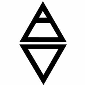
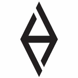
So she studied the Greek symbol for air, which can be translated to fresh air, which indicates the “outdoors.” And it didn’t hurt a bit that the Greek symbol resembles a mountaintop. Hah! There’s a chunk of concept for further thought.
Then Juli took into consideration the fact that NCOAE not only offers wilderness experiences that include rock climbing and hiking, but also water sports such as river rafting, canoeing and surfing, so she fiddled around with the Greek symbol for water.
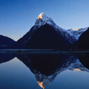
By piecing the two symbols together — one on top of the other — Juli created a perfectly simplified compass needle pointing north and south. As a bonus, the symbol resembled a reflective photo of a mountain peak image mirrored upside down in a pristine lake.
At this point, Juli knew she was making big progress. Here she had a brand mark that illustrated the symbol for Air, which equals the outdoors, which equals mountains, rock climbing and hiking. And she had the symbol for Water, which equals rafting, canoeing, etc., and now contained a compass needle pointing North and South, which equals adventure and exploration.
Some artists would have slapped their paint-stained hands together and said, “Voila!” or “Fin!” or some such. But not Juli. Something was still missing, and after a lot of thought, she realized her icon was lacking the educational aspect of what NCOAE truly has to offer.
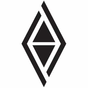
By separating the side lines of the triangles, Juli created directional arrows pointing East and West, effectively completing the 360 degrees of direction showing the completion of adventure and knowledge — all similar to concept of the Enso circle.
She said the design also showed her the motion of going back and forth, which she saw as the perfect way to convey “looking into the past to understand the future.” In other words, to acknowledge and understand conservation and environmental concerns.
Juli presented her brand mark to Zac and Celine, both of whom said they were most impressed with her design. No pine tree cutout, no setting sun, no seagulls.
Just an ancient Greek interpretation of all that is good about wilderness, education and NCOAE.
TALK TO US
Have any further questions about our courses, what you’ll learn, or what else to expect? Contact us, we’re here to help!
Leave a comment